Table of Contents
23 Best Google Fonts in 2023 for Branding and Web (Plus How to Use Them)
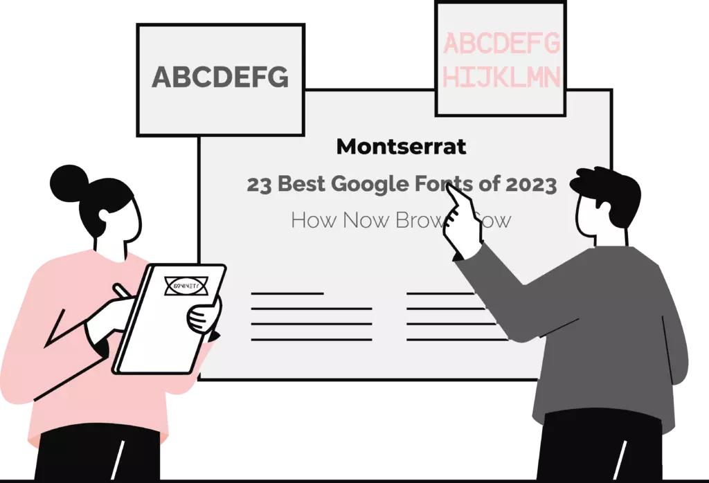
Whether as part of your brand development, graphics overhaul or web development, choosing a font that is right for you is an important decision. Typography is a considerable element of each design in every branded document, social media post, and blog article you produce. The typography your business chooses contributes to the aesthetic of your website and assists with the readability and accessibility it can offer. However, with over 1508 different Google Font families on offer, selecting the right font for your brand can be challenging.
So we at 89Ninety have decided to step in and help make the process that little bit easier. We’ve brought in members across each of our service teams from Social, Web, Branding, Graphic and to Creative to pull together our list of 23 Google Fonts for 2023 for your brand. There are so many facets that we are looking for within font choice. First of all, is it legible? Will your customers be able to read your social posts? Will they find your graphics intelligible? Even with your website, how will your font choices impact the user experience for your visitors? Will it positively or negatively affect your bounce and conversion rates?
So with all these questions in mind and our focused heads locked in, this post will delve into the Google Font trove to bring you 23 of the best Google Fonts for 2023. But first, the question you have already been asking in this article is, ‘Why Should Your Brand Use Google Fonts?’
Why Should Your Brand Use Google Fonts?
There are hundreds, even thousands of font repositories on the internet, from FontSquirrel to Envato, so what exactly makes Google Fonts the one for your brand and website?
Well, let us cut to the chase; it’s free! That is the number 1 reason to use Google Fonts; it is a massive repository of fonts with no strings attached and no return in seven years for your soul. It is entirely free. If you need another reason, it is maintained and delivered by Google, yeah, that Google, the one you found this article on. (Hey, SEO team, well done). You can guarantee they are safe by being maintained and delivered by Google. We have all been there, found a font realised it has a commercial license for a couple of hundred to a thousand, depending on the use case. We look down the dark Google search path for a free version (Don’t do that), and then mysteriously have a virus on your computer, with someone in Mother Russia or the NSA using your webcam to see what you’re up to on the daily.
What Google Fonts offers your brand, its socials, graphics and website, is a curated selection of over 1500 high-quality fonts, with no licensing restrictions that leave your hands tied. All the fonts, and we repeat all the fonts on Google Fonts repository are open source and completely free to use in commercial projects. Even better you can download or embed them easily within your WordPress website with the Google Fonts API. You have complete commercial use, whether on the web, through print or on social media.
What to Look For in a Google Font For Your Brand and Website?
Choosing the right Google Font is crucial when developing your brand, its materials and website design. Good typography can make or break your brand and site, as it can impact how long visitors stay and whether they become loyal readers or customers. Graphic designers, Web Developers, UX/UI evangelists and Brand Development geniuses spend years mastering font selection, but keeping a few principles in mind can help you pick the right font for your website. So here are 5 things to look out for when choosing a Google Font:
1. Fitting Your Brand
The most important aspect is choosing a font that reflects your brand’s personality while remaining readable and matching your design. For instance, Apple and Android use similar fonts because San Francisco and Roboto are built as more screen-friendly versions of Helvetica Neue. Still, they use vastly different fonts compared to Michael Bay and his bombastic Transformers, but they all suit their respective brands and what they are trying to achieve.
2. Readability
The following essential principle is readability. Even though a funky or edgy font may align with your brand and the aura you are trying to create for your business, visitors will lose interest if they cannot decipher the text. No one wants to work hard to read what you have to say. They just want to read it, not interpret hieroglyphs. Hence, choosing a font that appears professional and effortless to read is crucial.
3. Font Classification
Fonts can be classified in many ways, but the five main types are serif, sans-serif, script, monospace, and decorative. Serif or script fonts convey elegance, while monospace fonts are popular on tech sites. Knowing these classifications can help you start your search.
4. Display or Body Font
Display fonts are typically used for large sizes, such as headers or print projects, and can sacrifice some legibility for the sake of a unique design. On the other hand, body fonts should prioritise readability, as they make up the majority of your website’s text.
5. Mood and Intent
Fonts are designed for specific moods and settings, and most fonts come with notes on how they were designed and their intended use. Use these notes to decide whether the font suits your project.
The 23 Best Google Fonts in 2023 for Branding and Web
How do we create a list of the 23 best Google Fonts when so much subjectivity is involved? We will rely on data to compile a list of the most popular Google Fonts to avoid bias, but our team will be overseeing the potential choices to come up with our own opinions based on experience and Google’s empirical data. We will use Google Fonts analytics, which has over 50 trillion total font views, but you’re on our article, so we will have the final say as we have done all the heavy lifting choosing the best 23 Google Fonts. Are you ready to explore the list of the 23 best Google fonts in 2023? LFG boi!
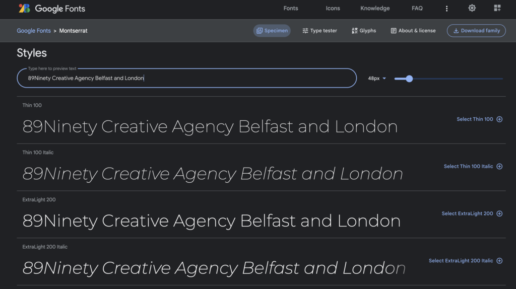
No.1 on our list and number 4 on Google Fonts, our top choice is Montserrat. Used in over 17,000,00 websites, Julieta Ulanovsky was inspired by the vintage posters and signs of the traditional Montserrat neighbourhood in Buenos Aires to create a typeface that pays homage to the urban typography of the first half of the 20th century. As urban development changes the area, the unique and special designs of the past are lost forever. Ulanovsky’s project seeks to rescue the beauty of Montserrat and release it under a libre license, the SIL Open Font License.
The Montserrat typeface family includes two sister families, Alternates and Subrayada. The Alternates family features special letterforms, while the Subrayada family celebrates a unique style of underlining integrated into the letterforms of Montserrat.
In November 2017, Jacques Le Bailly at Baron von Fonthausen redesigned the entire family, making the Regular weight lighter and more suitable for use in longer texts. Cyrillic support was also added to the font under the leadership of Julieta Ulanovsky, Sol Matas, and Juan Pablo del Peral, with consultation from Carolina Giovagnoli, Maria Doreuli, and Alexei Vanyashin.
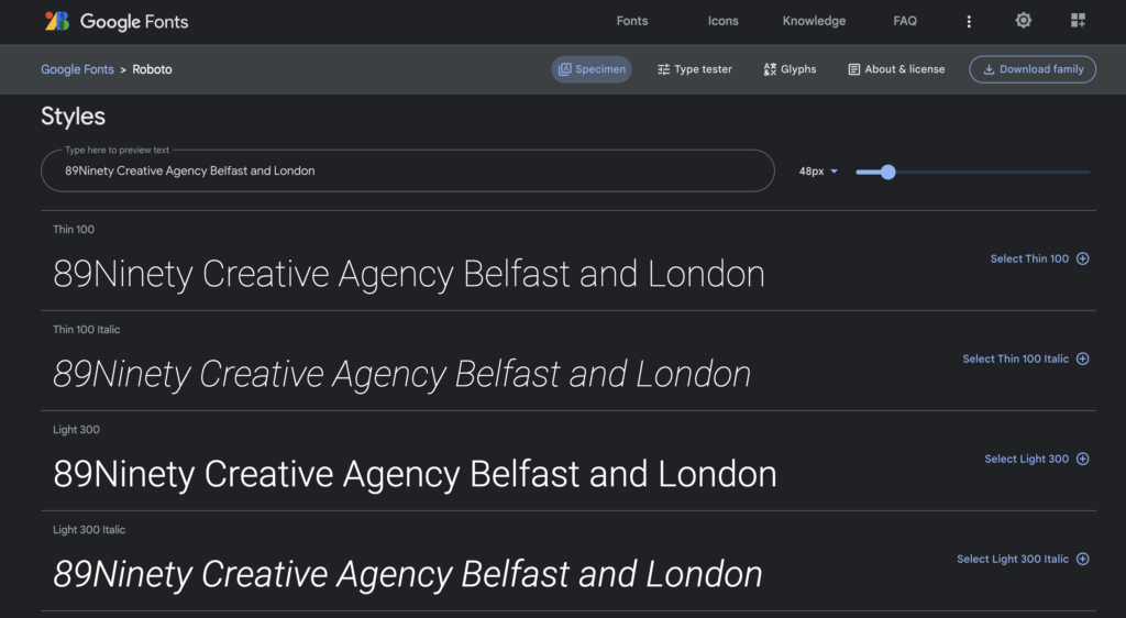
Coming in at number 2 with the 89Ninety team, and number 1 on Google Fonts with over 620,000,000 websites using the font, Roboto is clearly a runaway choice for designers.
Roboto is a sans-serif typeface created by Christian Robertson and developed by Google as the system font for Android. It has become extremely popular, with 12 different styles and multiple appearances on Google Fonts’ analytics.
Roboto is not only the most popular font, but Roboto Condensed is also the sixth most popular, and Roboto Slab is ranked at number 12. The font’s unique blend of features is characterised by its geometric and mechanical structure, as well as its friendly and open curves. Unlike other grotesque fonts that force a strict rhythm by distorting letterforms, Roboto maintains the natural width of the letters, creating a more fluid and humanistic reading experience similar to that of serif fonts.
The regular Roboto family is intended to be used in conjunction with the Roboto Condensed and Roboto Slab families.
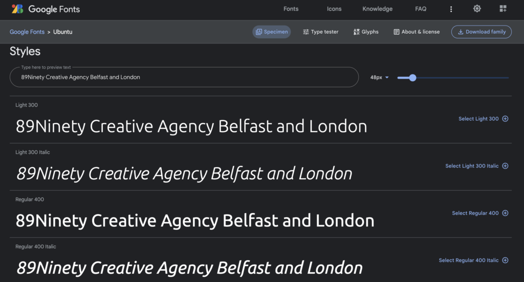
Ranked third on our list and fifteenth on Google Fonts, Ubuntu is currently used on over 5,000,000 websites. The Ubuntu Font Family is a set of new libre/open fonts developed between 2010 and 2011. The project was funded by Canonical Ltd on behalf of the Free Software community and the Ubuntu project, while the technical font design work and implementation was carried out by Dalton Maag.
The final font files, as well as the design files used to create the font family, are distributed under an open license, allowing users to modify, experiment, share and improve them.
The Ubuntu Font Family was created to give Ubuntu a unique identity and make it more prominent in every menu, button, and dialogue. The typeface is sans-serif, uses OpenType features, and is manually hinted to ensure clarity on both desktop and mobile computing screens.
The Ubuntu Font Family project aims to include all languages used by Ubuntu users worldwide, in line with Ubuntu’s philosophy of enabling every user to use the software in their preferred language. As such, the project will expand to cover many more written languages.
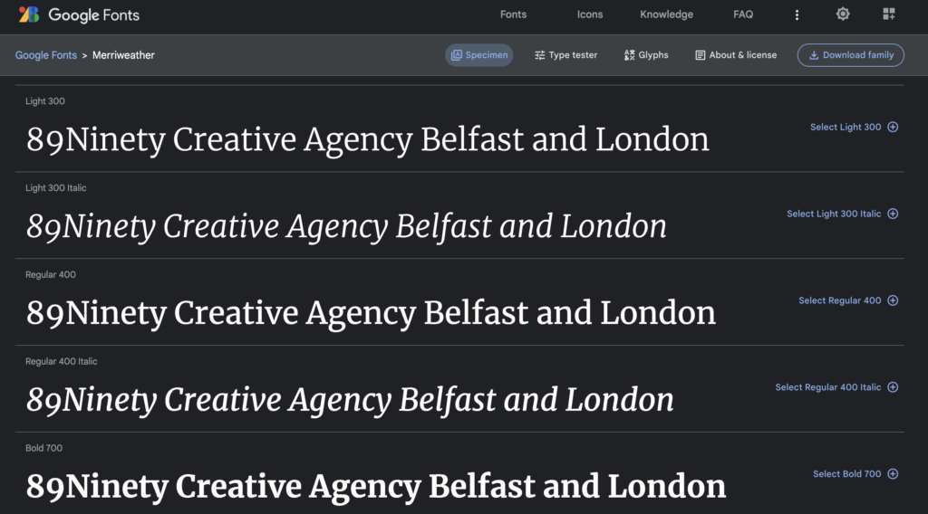
Coming in at number four on our list is Merriweather. It was specifically designed to be a text font that is easy to read on screens, with features such as slightly condensed letterforms, a large x-height, sturdy serifs, and open forms. Merriweather Sans, a sans-serif version, complements the weights and styles of the serif family. The project is led by Sorkin Type, a type design foundry based in Western Massachusetts, USA.
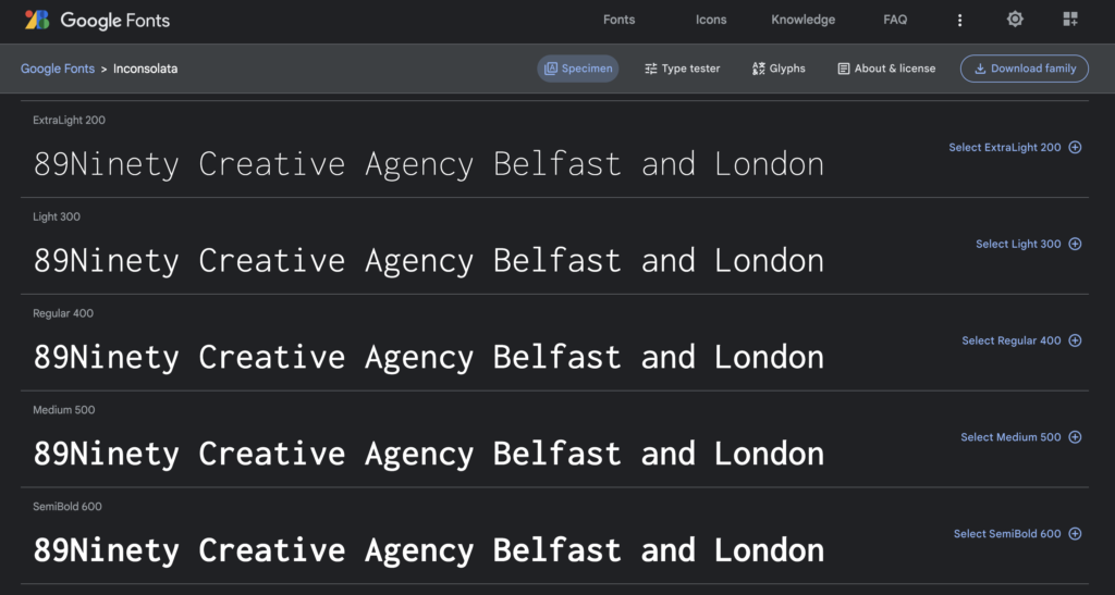
At number 5 on our list of 23 best Google fonts is Inconsolata, which was Raph Levien’s first major original font release. This monospace font was specifically designed for printed code listings and similar uses. Although there are many “programmer fonts” available for use on screens, few pay attention to the finer details required for high-resolution rendering.
Inconsolata draws inspiration from a variety of sources. Levien was particularly impressed by the elegance of Luc(as) de Groot’s Consolas, which was created for Microsoft’s Vista release. This font, like de Groot’s earlier TheSansMono, convinced Levien that monospace fonts can be visually appealing.
The Regular style of Inconsolata was developed by Levien in 2006, using his own Spiro-based tools and FontForge. Kirill Tkachev and the Cyreal foundry designed the Bold style in 2012. In September 2015, the internal metadata was corrected, and in April 2020, the family was upgraded to a variable font family.
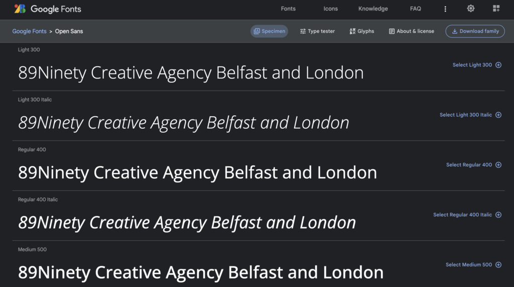
Open Sans, ranked 6th in our list of the 23 best Google Fonts in 2023, is a sans-serif typeface with a humanistic touch. It was designed by Steve Matteson, who serves as the Type Director of Ascender Corp. This font family comprises a total of 897 characters, including standard ISO Latin 1, Latin CE, Greek, and Cyrillic character sets. Open Sans has a clean and friendly appearance with upright stress and open forms. It was created with optimisation for print, web, and mobile interfaces in mind, and features excellent legibility characteristics in its letterforms.
In March 2021, the Open Sans family underwent an update to a variable font family, with the addition of Hebrew support. The update also streamlined the licensing process under the OFL.
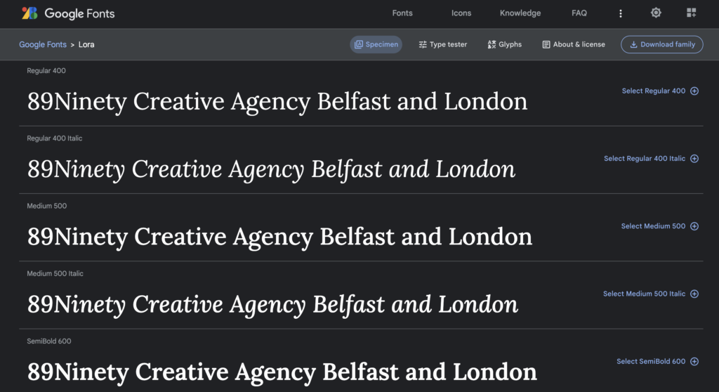
Lora secures the 7th spot on our list of 23 best Google fonts in 2023. This contemporary serif font has a calligraphic origin and boasts a well-balanced design. It has a moderate contrast that makes it ideal for body text, and its brushed curves with driving serifs make it visually striking. Lora’s overall typographic style effectively captures the mood of modern-day stories and art essays. Additionally, Lora is optimised for both screen and print use, making it versatile in various contexts. In March 2019, Lora’s family was updated to a variable font family.
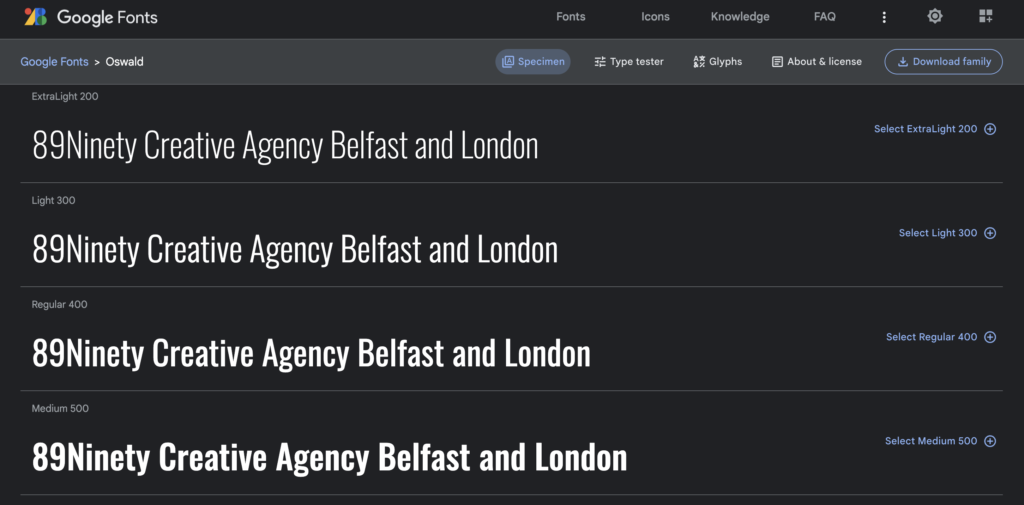
Number 8 on our list of the best Google Fonts is Oswald, which is a modern interpretation of the classic style originally represented by the ‘Alternate Gothic’ sans-serif typefaces. The characters of Oswald were redesigned to better align with the pixel grid of standard digital screens. Oswald is freely available for use on desktop computers, laptops, and mobile devices.
Since its launch in 2011, Oswald has been continually updated by Vernon Adams until 2014. Vernon added Light and Bold weights, support for more Latin and Cyrillic languages, and made many glyph refinements throughout the family based on user feedback. In 2016, Kalapi Gajjar completed the Latin part of the family’s update. In January 2019, Oswald was updated with a variable font Weight axis.
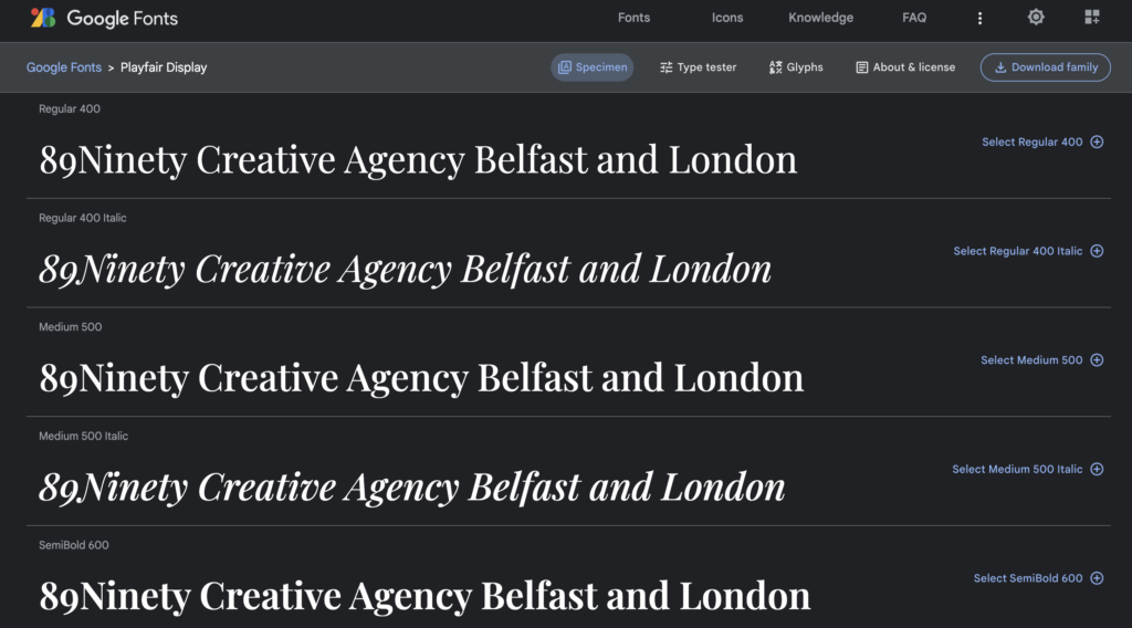
Ranked at number 9 on our list, Playfair Display is currently deployed on 2.9 million websites. This transitional typeface was developed during the European Enlightenment period in the late 18th century when pointed steel pens replaced broad nib quills as the popular writing tool. With advancements in printing technology, ink, and paper making, letterforms with high contrast and delicate hairlines became possible, resulting in designs that were increasingly detached from handwritten letterforms.
While Playfair Display is not a revival of any particular design, it takes inspiration from the works of John Baskerville and Scotch Roman designs. As a transitional typeface, it is well-suited for use in large display sizes and can complement Georgia for body text. The font family includes a small caps version called Playfair Display SC, as well as full sets of common and discretionary ligatures. The family was updated in November 2017 with language support and minor improvements and converted to a variable font in August 2019. The Playfair project is led by Claus Eggers Sørensen, a type designer based in Amsterdam, Netherlands.
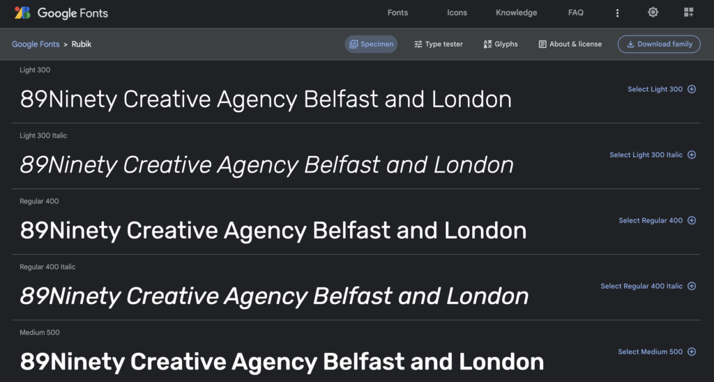
At number 10 on the list of the 23 best Google Fonts for 2023 is Rubik, a sans serif font family with slightly rounded corners. It was designed by Philipp Hubert and Sebastian Fischer at Hubert & Fischer as part of the Chrome Cube Lab project. The family consists of five weights with Roman and Italic styles, and also includes Rubik Mono One, a monospaced variation of the Black Roman design. In 2015, the Hebrew component was redesigned by Meir Sadan, and in 2016, the Cyrillic component was redesigned by Alexei Vanyashin. Rubik is currently deployed on over 1.3 million websites and is still growing in popularity.
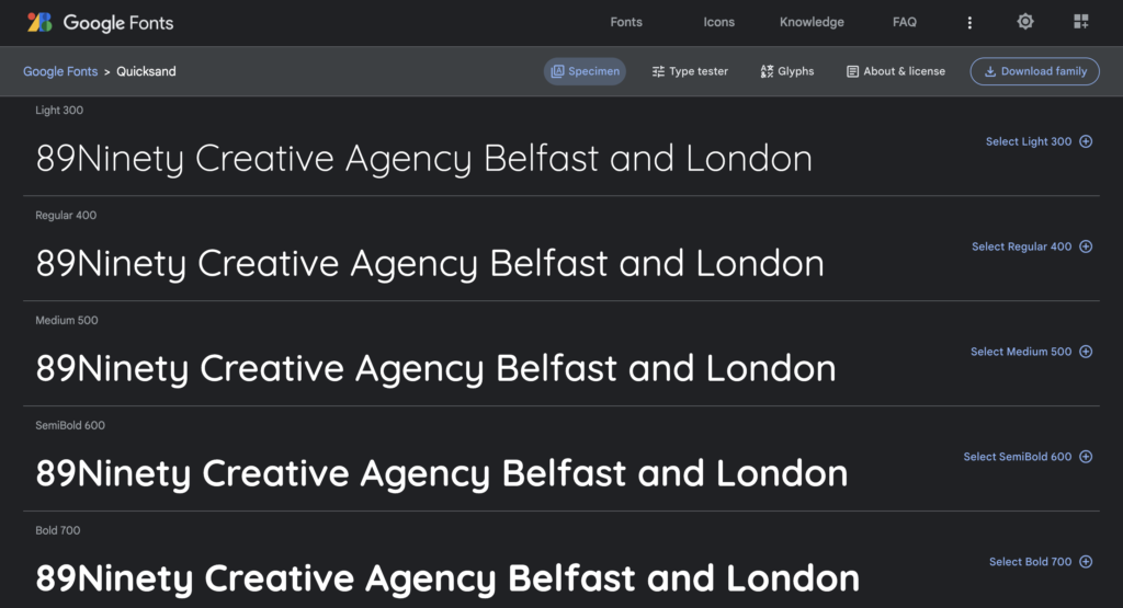
At number 11 on our list, we have Quicksand, a display sans serif font with rounded terminals. Andrew Paglinawan initiated the project in 2008 using geometric shapes as a core foundation. The font is designed for display purposes but remains legible even in small sizes. In 2016, Thomas Jockin thoroughly revised the font in collaboration with Andrew to improve its quality. In 2019, Mirko Velimirovic converted the entire font family into a variable font.
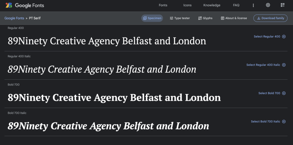
Coming in at number 12 on our list is PT Serif. This font family was developed as the second pan-Cyrillic typeface for the “Public Types of the Russian Federation” project, following the release of the first family, PT Sans, in 2009. The fonts are freely available under a libre license, allowing the people of Russia to read and write in their native languages. The project was initiated to commemorate the 300th anniversary of the civil type invented by Peter the Great between 1708 and 1710, and was financially supported by the Russian Federal Agency for Press and Mass Communications. PT Serif includes standard Western, Central European and Cyrillic code pages, as well as characters from all title languages in the Russian Federation, making it an essential tool for modern digital communication. The humanistic transitional serif typeface features terminals that are designed to harmonise across metrics, proportions, weights, and design. The family comprises six styles, including regular and bold weights with corresponding italics, as well as two caption styles for use in small point sizes.
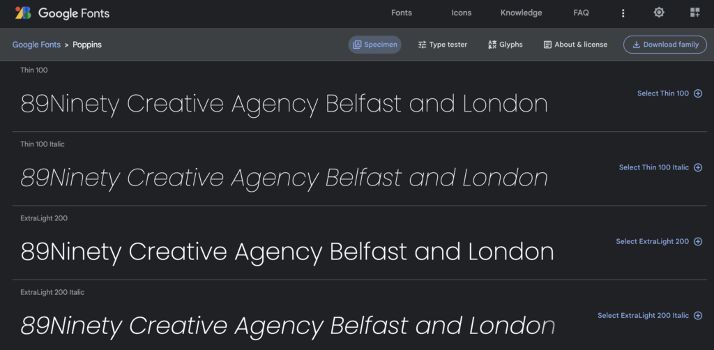
Poppins takes the 13th spot on our list of the best Google Fonts for 2023. As a geometric sans serif typeface, it follows a long tradition of popular design tools used in the world of typography. Poppins, however, offers a fresh take on this genre with its support for the Devanagari and Latin writing systems, making it an internationalist design. The Latin glyphs, including the ampersand, have a more constructed and rationalist feel than typical geometric sans serif typefaces. The Devanagari design is also new, making it the first ever Devanagari typeface to have a range of weights in this genre. The letterforms are nearly monolinear, with optical corrections applied to stroke joints where necessary for even typographic color. Additionally, the Devanagari base character height and the Latin ascender height are equal, while Latin capital letters are shorter than Devanagari characters and the Latin x-height is set higher. Poppins has already been used by several brands across their branding, websites, and social media posts.
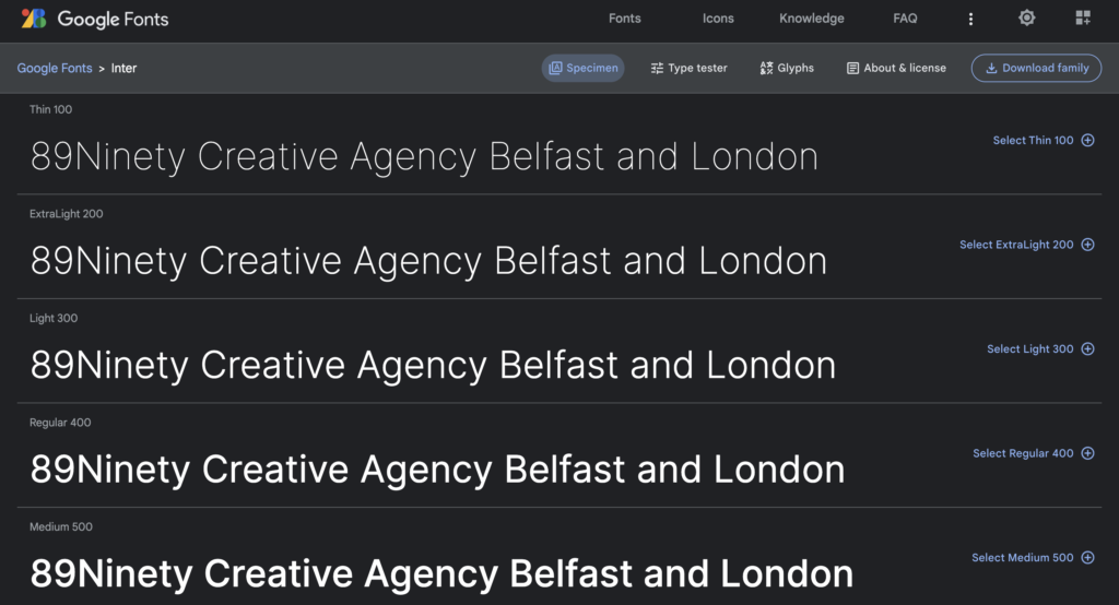
Ranked at number 14 on our best Google Fonts for 2023 list is Inter, a variable font family that has been deployed on nearly 1 million websites. Inter was designed specifically for computer screens, with a focus on legibility. It has a tall x-height, which makes it easier to read mixed-case and lowercase text. Additionally, Inter includes several OpenType features, such as contextual alternates that adjust punctuation based on surrounding glyphs, slashed zero to differentiate between “0” and “o”, and tabular numbers.
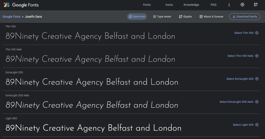
Josefin Sans takes the 15th spot on our list of 23 best Google fonts and is a beloved option among users. The font’s design is centered around geometry and elegance with a touch of vintage, making it ideal for use at larger sizes. The inspiration for its creation stems from geometric sans serif styles from the 1920s. One unique aspect of the typeface is its x-height, which is halfway between the baseline and cap height. Additionally, there is a sister font family called Josefin Slab. In December of 2019, an update was released for the font, adding a Variable Font “Weight” axis.
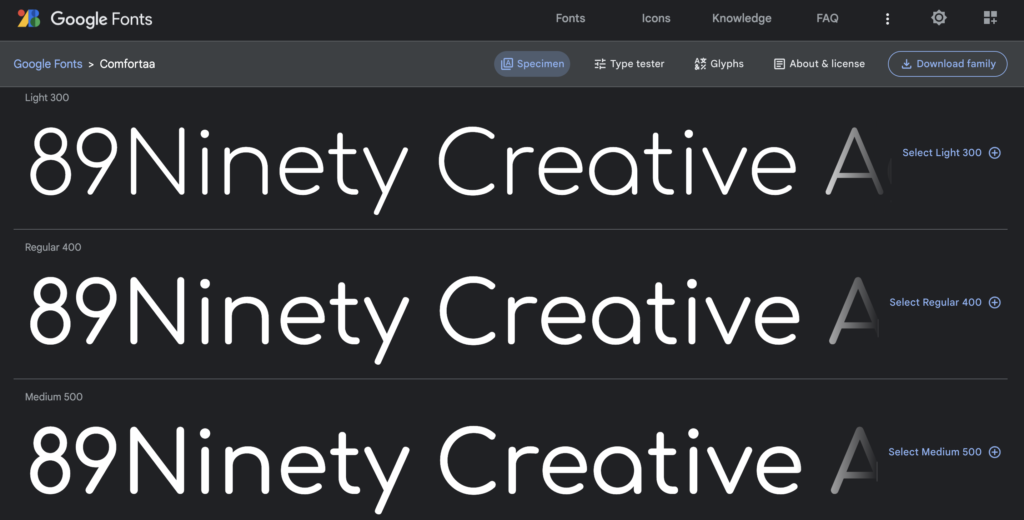
At 16 on our list is Comfortaa is a rounded geometric sans-serif type design intended for large sizes. It is absolutely free, both for personal and commercial use.
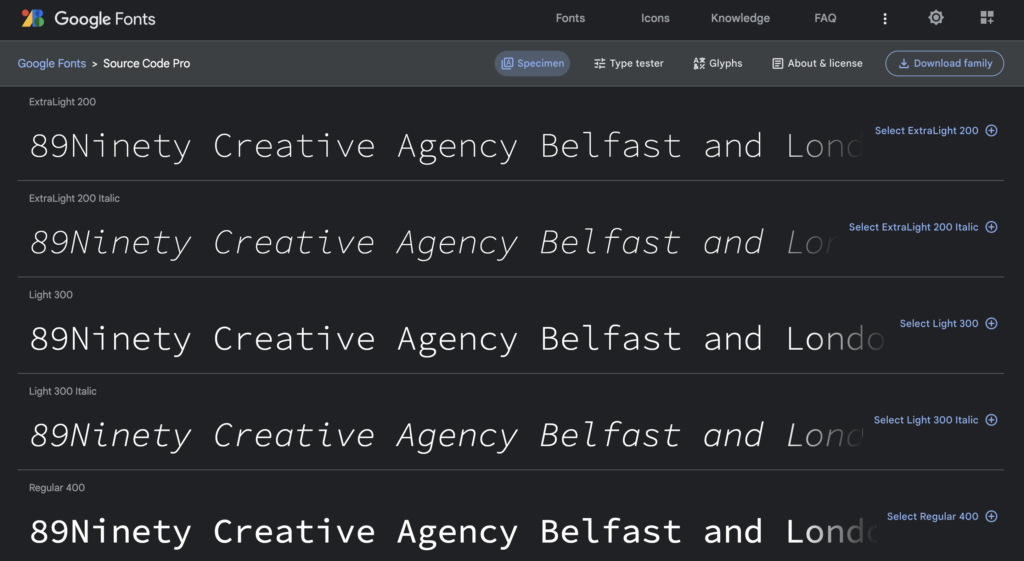
Ranked at number 17 is Source Code Pro on our list of best Google Fonts for 2023. It was created by Paul D. Hunt as a companion to Source Sans, with the intention of designing a monospaced version for coding applications. Source Code Pro maintains the same vertical proportions and design features as Source Sans, but adjusts glyph widths to be uniform across all weights and glyphs. While primarily designed for coding environments, Source Code Pro is available in a range of weights similar to Source Sans. The font supports a variety of languages that use the Latin script and includes all characters in the Adobe Latin 4 glyph set. It is an open-source project, so it is expected to receive incremental updates over time to expand glyph set coverage and functionality. In 2019, the family was updated to Roman v2.030 and Italic v1.050, adding support for Greek, Cyrillic, Vietnamese, and Italic styles.
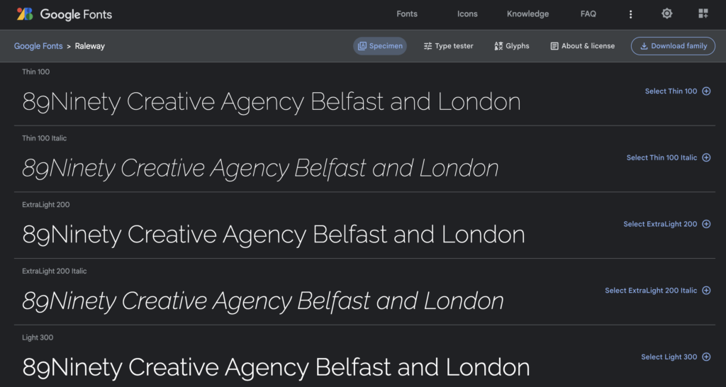
Ranked at number 18 on our list of the 23 Best Google Fonts of 2023 is Raleway, a popular choice with over 6.4 million websites utilising this elegant sans-serif typeface family. Originally created by Matt McInerney as a single thin weight, the family was later expanded to include nine weights by Pablo Impallari and Rodrigo Fuenzalida in 2012, and was further refined by Igino Marini through the process of iKerning. In 2016, a thorough review and italic were added to the font family.
Raleway is considered a display face and is available for download with both old style and lining numerals, standard and discretionary ligatures, a complete set of diacritics, and a stylistic alternate inspired by more geometric sans-serif typefaces. The font also includes a sister family, Raleway Dots.
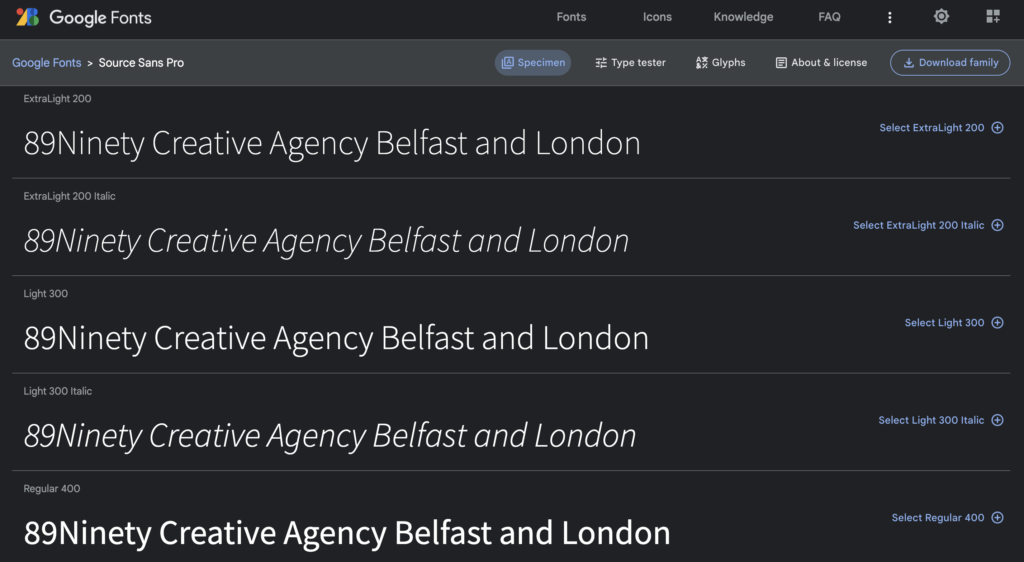
At number 19 on our list of the 23 Best Google Fonts of 2023, we have Source Sans Pro. Designed by Paul D. Hunt, Source Sans Pro is Adobe’s first open-source typeface family. It is a sans-serif font that is optimised for user interfaces and is currently being used by over 16 million websites, making it a popular choice.
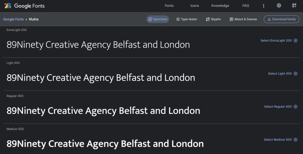
Mukta secures the 20th spot on the list of the 23 best fonts of 2023. It is a modern, humanist, and versatile typeface family that follows Unicode standards. Mukta has seven weights and supports Devanagari, Gujarati, Gurumukhi, Tamil, and Latin scripts. It is a libre licensed version of Ek’s multi-script project, which aims to create a unified type family for all Indian scripts without any single script’s features dominating over others. This makes the fonts suitable for both single and multi-script applications. Girish Dalvi and Yashodeep Gholap designed Mukta, while Noopur Datye and Pallavi Karambelkar designed Mukta Vaani. Aadarsh Rajan designed Mukta Malar, and Shuchita Grover and Noopur Datye designed Mukta Mahee. The font design process received valuable suggestions and feedback from Vinay Saynekar, Santosh Kshirsagar, Shubhanand Jog, Yogesh Jahargirdar, Pradnya Naik, Snehal Patil, Omkar Shende, Dave Crossland, and faculty and friends from the Industrial Design Centre, IIT Bombay, and Sir J J Institute of Applied Art.
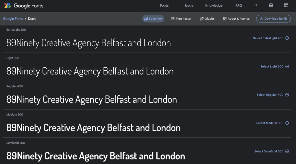
Coming in at number 21 on our list is Dosis, a sans-serif type family with rounded edges. Initially, it only had the Extra Light style, which was only suitable for sizes of 36pt or larger. The Extended Latin character set featured several alternative characters, all created by Edgar Tolentino and Pablo Impallari. In September 2011, Dosis was expanded into a complete set of weights. In 2019, it was updated and remastered as a variable font.
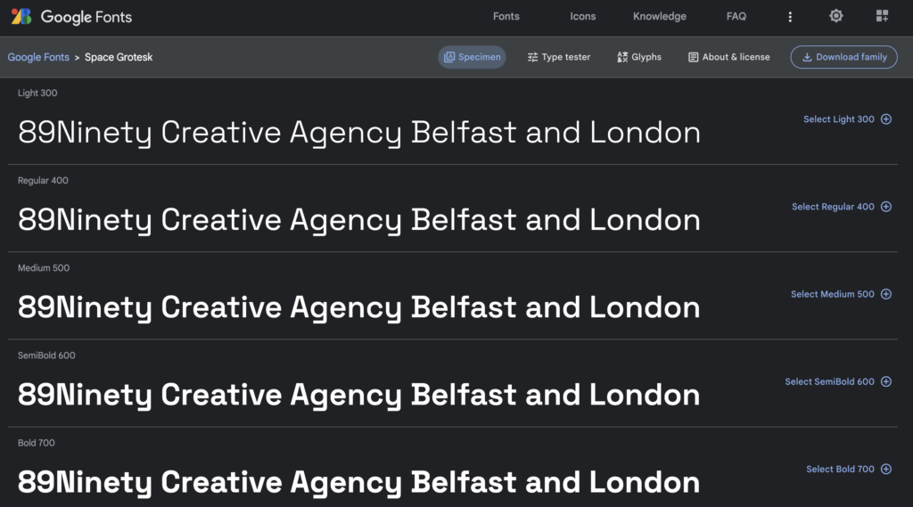
Coming in at number 22 on our list of 23 best Google fonts is Space Grotesk. This is a proportional sans-serif typeface variation that was based on the fixed-width Space Mono family by Colophon Foundry in 2016. Florian Karsten originally designed Space Grotesk in 2018, with the intention of retaining the idiosyncratic details of the monospace font while optimising it for readability at non-display sizes. Space Grotesk provides support for Latin Vietnamese, Pinyin, and all Western, Central, and South-Eastern European languages. It also includes several OpenType features such as old-style and tabular figures, superscript and subscript numerals, fractions, and stylistic alternates.
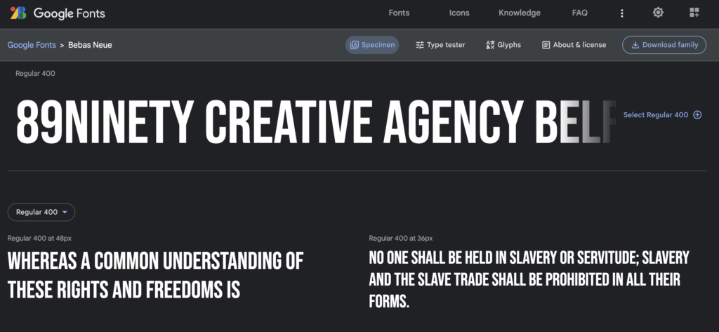
The final font on our list of the 23 best Google fonts of 2023 is Bebas Neue, which ranks at number 23. It was designed by Ryoichi Tsunekawa and is a display typeface family that works well for headlines, captions, and packaging. Bebas Neue is based on the original Bebas typeface and is suitable for professional users due to its extended character set and OpenType features.
How to Create the Best Google Fonts Combinations?
Choosing one font from our list of the 23 best Google Fonts of 2023 can be tough, but pairing them up on your website can be even harder. Luckily, you don’t have to solve this problem alone. There are a few ways to come up with the best Google Fonts combinations.
The first way is to check out the Google Fonts website itself. If you scroll down the page for your chosen font, you’ll see popular pairings suggested by the site. However, if you’re still not satisfied, you can also use a site like Font Pair to get more ideas.
Using a secondary font can also add some personality to your website, especially if your main typeface is formal or serious. Pairing it with a friendlier font can make your brand more approachable. Additionally, you can choose to use additional weights, widths, and styles when you need more variation in your initial typeface. For example, you might opt for a heavier typeface to make headings stand out from the rest of your text.
So what is next when you have your chosen Google Font?
Well, to begin, you can check out our article on incorporating Google Fonts into your WordPress website. Additionally, if you’re interested in branding, we have an excellent article on the 6 benefits of cohesive branding and why a logo isn’t enough.
If you’d like to speak with our Creative team at 89Ninety about branding, web design, or social media marketing, you can reach out to us via phone, email, or direct message. Our creative agency has offices in Belfast and London and serves clients in Ireland, the UK, and North America. We take a holistic approach to branding, going beyond just logos and fonts to truly understand your brand, and this approach is reflected in every service we offer. If you have any further questions about branding or business development, please don’t hesitate to contact us through our website. Also, feel free to explore our other articles to learn more about how we can elevate your UK or Irish business branding.
